Is the Circle Line signage confusing because we don’t know what’s clockwise and anticlockwise — or because whoever printed the signage doesn’t?
Commuters are calling out Circle Line platform maps for being confusing as some of them curve the opposite way from what the platform screens suggest. But with the maps being the result of some reprints themselves, are we wasting time and money because we didn’t get things right the first time?
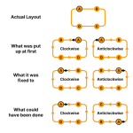
Initial map update
Ahead of the Circle MRT Line Stage 6 opening, route maps above the platform screen doors were updated in preparation for the line becoming a full circle. Instead of a simple horizontal line, the maps curved towards themselves in the south. The signage was covered in patches of stickers with blank or greyed areas over CCL6 to be peeled off later.
In late 2025, new maps at MacPherson, Bishan and Paya Lebar were spotted showed both directions with the same orientation (e.g. both running anticlockwise). One platform was geographically correct, but the other was mirrored horizontally with Dakota on the left and Kent Ridge on the right.
Using the same curve for both directions was a strange choice — but understandable if directions were meant to be termed “Inner Loop” and “Outer Loop”. After all, those were the terms previewed before during public consultations on CCL6 wayfinding.
Late-May reprinting
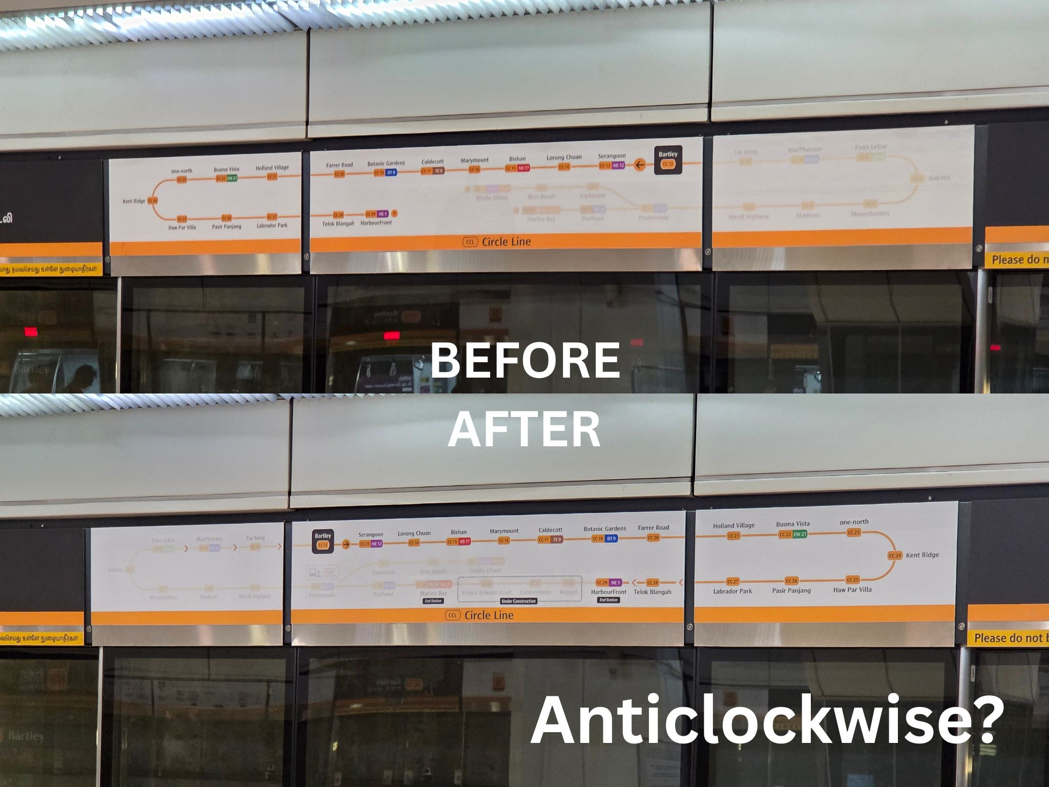
Closer to the CCL6 opening date in late May, platform route maps were adjusted — layers were peeled off to reveal the CCL6 stations (albeit covered by “under construction”), and platform directions were revealed as “via <next interchange>”.
Instead of just having patches peeled off, the maps at MacPherson, Paya Lebar and Bishan were totally reprinted. Yet after reprinting, now both maps flow clockwise instead — the formerly correct anticlockwise platform was now flipped to clockwise. This was despite the trains running “Clockwise” and “Anticlockwise” (which won the poll over “Inner”/“Outer”).
FAQ explanation
On 29 May, when the directions “Clockwise” and “Anticlockwise” were announced to be official, a FAQ document revealed that platform maps were oriented to follow the train’s left/right movement, not geographically accurate clockwise/anticlockwise travel.
This meant the signs above the doors at MacPherson, Serangoon, Bishan, Paya Lebar and other stations were originally wrong for both platforms.
But given how defensive the argument sounds, one could be forgiven for thinking this was an attempt to avoid further correction by focusing on an advantage the current messy layout does have.
Do we even need to flip?
The argument that platform route maps should flip despite directions being outright named “Clockwise” and “Anticlockwise” does not seem to hold much water. Might it be that whoever designed the signage simply mirrored the maps out of autopilot? After all, for non-circle lines, the platform route maps are mirrors of each other — they are linear. So for the North-South Line, for example, one platform will have Jurong East on the left and Marina South Pier on the right, and the other will have Marina South Pier on the left and Jurong East on the right (assuming an island platform).
But if alignment with train movement was the goal, we could see that another way — rather than assume the diagrams at the linear lines are flipped, why not treat them as rotated 180 degrees? Rotating the Circle Line diagram 180 degrees would preserve clockwise or anticlockwise rotation while still allowing both platforms’ small arrows to follow the train movement.
Even if the maps are not flipped or rotated, and the map moves in a direction opposite to the train, it’s arguably okay — there’s another part of the platform sign that does align with train movement.
What you see on the first row, with the large arrow towards next interchange, will point the same way the train travels regardless. So what’s really wrong with the route map (second row) having a small arrow “pointing” the other way if doing that makes it correctly clockwise/anticlockwise without rotating, and reduces the mental load for passengers?
What’s the deal?
The platform maps now look more like a layout or template usage error than an intentional navigation design, causing confusion. Many commuters have posted about the platform maps being “wrong” as most stations with island platforms have at least one platform map flipped. Stations that are on the north half of the Circle Line will have both platform maps curving clockwise (since the top row flows right and bottom row flows left), while stations that are on the south half of the Circle Line will have both platform maps curving anticlockwise.
The bigger issue is not whether route maps being reversed is technically defensible. It’s that the consideration of aligning the path of the platform maps with the train movement by flipping, which has the potential to cause a lot of confusion and add mental load to passengers, should have been surveyed during the public consultation in addition to just the names of the directions.
Even with an unannounced delay to CCL6’s opening buying extra prep time, the “fixed” signage still included obvious errors that passengers immediately noticed.
Given the amount of feedback against the mismatched directions, it’s possible we might see a second money-spending exercise to correct the “mistake” of the first. But effort should be taken to get things right the first time. What happened to “measure twice, cut once”?
What should have happened
In the first place, whether or not you believe that the designers wanted the maps to align with train movement direction, the maps at Bishan, Paya Lebar, MacPherson and other stations were clearly printed wrongly. The signage should have been planned coherently and proofread from the start.
If mirroring maps to match train movement was really a consideration the design from the start, that should have been in the poll during public engagements on CCL wayfinding — a question should have been included for respondents to vote on whether flipping the map was really necessary, if keeping the map the same was better, or if rotating was preferred instead. And once “Clockwise” and “Anticlockwise” were chosen in that poll to beat out “Inner” and “Outer” directions, the mirroring of the maps should have been reviewed in conjunction so it wouldn’t be counterintuitive with the actual service naming.
Had this review process been done, there could have been a chance to realise earlier that mirroring of the maps would cause lots of confusion. And when the “wrongly printed” maps at MacPherson and other stations were discovered, we might have been able to take the chance to reprint only one instead of both, saving resources.
Right now, what we have is a messy wayfinding system that’s confusing and adds mental load to passengers just trying to confirm they are at the right platform.
Summary
- Some CCL stations started off with both platforms’ maps anticlockwise, then change to both platforms clockwise — and that doesn’t seem to be what passengers want.
- It’s not clear what was truly the consideration from the start when designing the platform maps, and “following the movement of the train” is a rationale that feels retrofitted.
- Making some platform maps curve the opposite of the actual train service direction adds mental load to passengers and causes confusion.
- Even if following train movement was a key consideration, rotating the map where necessary instead of mirroring it would have been much better.
- More importantly, these questions should have been brought up during public consultation on post-CCL6 wayfinding, not during hasty reprints after reprints now especially when the opening was delayed.
- Coherent wayfinding vision from the start matters to avoid wastage of time and money.
This is a guest post by @transporttakes.you
View this post on Instagram
My opinion regarding this would be that the anticlockwise/clockwise diagrams in stations are the confusing part since it is newly introduced.
One possible solution would be to name the lines anticlockwise and clockwise, but use a regular line instead of using a circular diagram. After the line, indicate the train would continue travelling in a circle.
And to think all this confusion could’ve been avoided if the circle line was a true circle without a weird branch… because then maps could just say via [next interchange], without having to worry about random short turns in the line and having to also cram that information into signage.
Ah, not likely that the confusion would have been averted, as we still have to call the services different thing, and a line diagram will still needed to be printed.
In my opinion, the best approach is to clearly indicate train directions on the PSD signage, for example “Platform A – Clockwise” and “Platform B – Anticlockwise.” The same directional information should also be displayed on the MRT and LRT system maps to improve clarity for commuters.
I mean having a circular line has its own issues but there’s a lot of complication for nothing.
The two key designs are the running direction of the train, and the preservation of clockwise / anticlockwise direction. This can clearly be solved:
train running right, clockwise: put the current station in the top row
train running right, anticlockwise: put the current station in the bottom row
train running left, clockwise: put the current station in the bottom row
train running left, anticlockwise: put the current station in the top row
They seem to have sacrificed this fundamental design to force the current station into the top row no matter what – I don’t know why, since it’s a choice that doesnt matters at all for wayfinding.
Keep it simple la. Why make until so complicated? In engineering, it’s always about simplicity (that’s why engineers tend to draw simplified line diagrams to facilitate understanding and problem solving). Anyway, for the circle line, it’s just clockwise and anticlockwise, got so hard meh? Whatever is described in this article, is probably just they paste the wrong panel at the wrong platform.
just like the circle line you managed to miss the entire central point of the post, but also just like the circle line eventually somehow arrive at the correct conclusion. congrats
(and to circle back to your claim, engineers can only simplify down diagrams if they have a well-rounded understanding of how the system works first. feel free to loop back and read the post again if you need any further clarifications)